Here’s a rough sketch of the pull-down menu:
https://codepen.io/hayavuk/pen/qBLEzQj
Here’s a short summary of how it is intended to work.
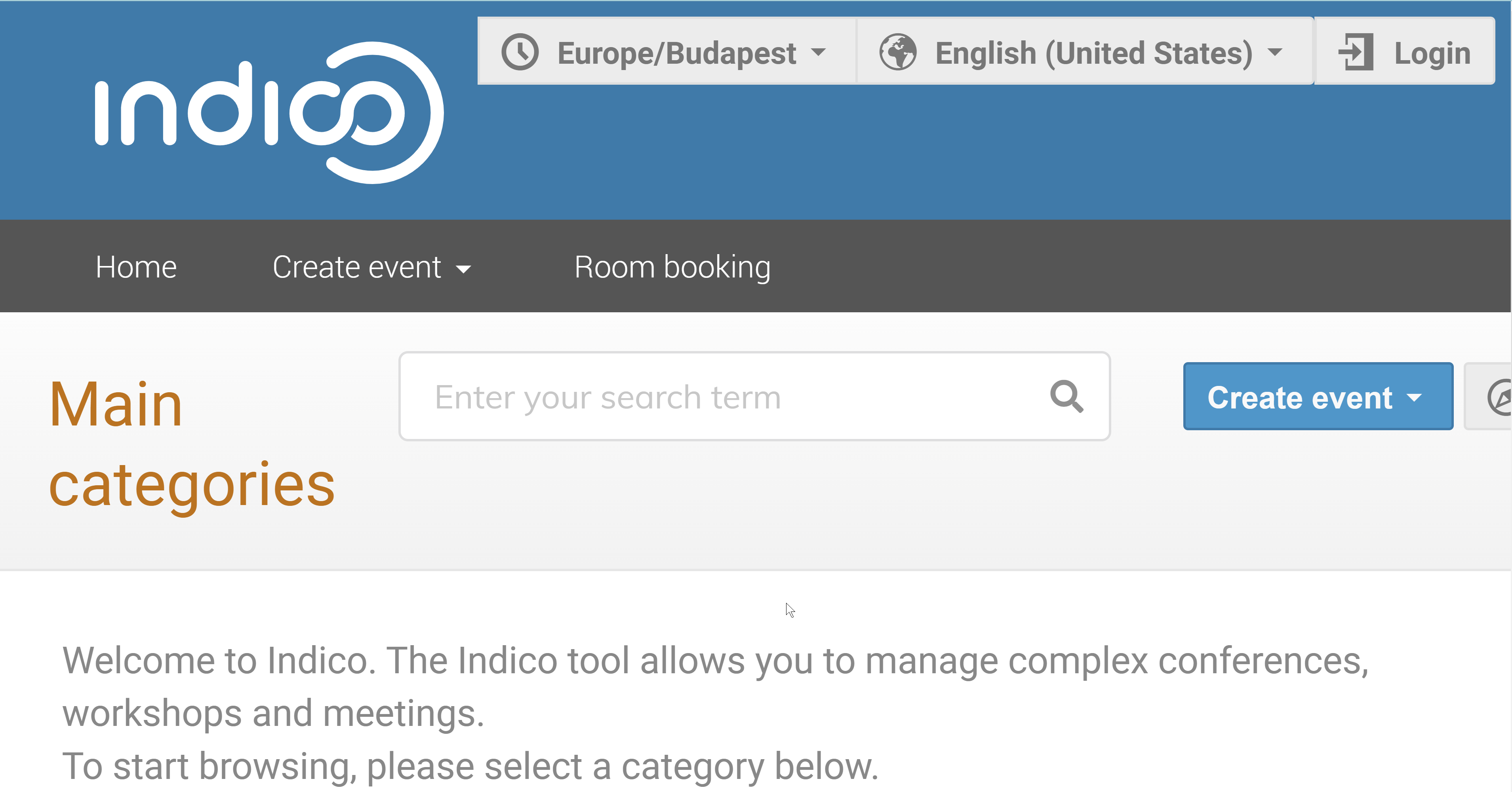
TZ indicator in the header
Although the actual time zone selector is moved into the pull-down menu, I’ve kept the TZ indicator as a separate item in the header. This is because this information should be available on category/event page to show the category/event time zone in case the user selects that option.
The TZ indicator is also a button that opens the menu. I did not make part of the menu button itself because they need different accessible labels.
Animation
There is no animation on this widget. This is intentional due to its large surface and potential to create motion sickness for some users. Since the effect is mostly cosmetic, I opted for avoiding the animation altogether rather than using prefer-reduced-motion media query to disable it.
Session toolbar (pull-down menu)
The session toolbar is laid out as a pull down menu.
I styled this to the extent of demonstrating the intent, so the styling is not perfect. 
This section is responsive, so it should naturally collapse into a single-column layout on small screens.
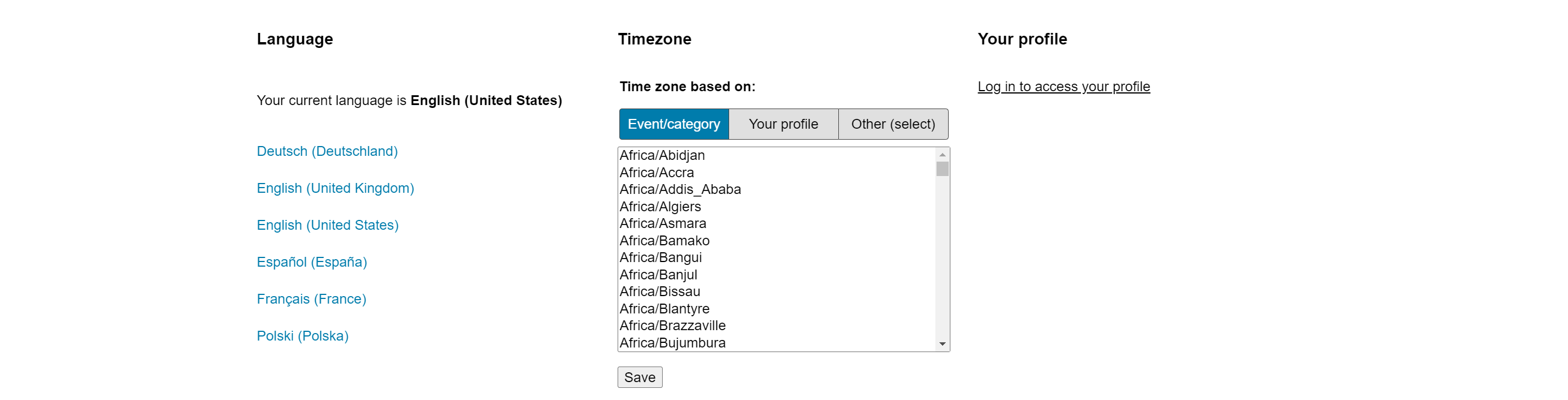
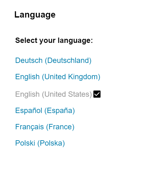
Language selector
The language selector is implemented as a form that submits as a normal form. There is no JavaScript involved in this, and in combination with a new redir parameter that will be added to the /change-language endpoint, we should be able to perform the same behavior that we have now without using any client side JavaScript.
A checkmark is added to the selected option to make it more obvious.
Hidden text is included before the list that indicates the current selection to the screen readers and other accessibility tools.
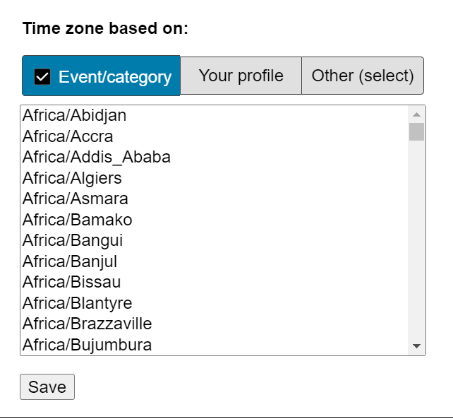
Time zone selector
The TZ selector is the second section in the session toolbar. I’ve experimented with a modification to the UX. Rather than having three radio buttons one above the other, I’ve condensed the labels to the essential keywords and extracted the common label into the fieldset legend.
Checkmark is included in the button (label element) to indicate the current selection, in addition to changing the background of the selected item. (There is an obvious color contrast issue here due to the use of emojis, but you get the idea.)
Another modification that was made to the form is that it does not disable the select list, and instead automatically toggles the radio to “Other” when the select list is clicked. I still have not figured out a better way to indicate the relationship between the select list and the three buttons above it, but this should at least help the user develop some intuition about it.
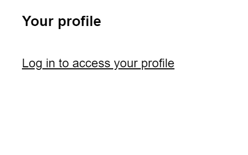
User profile section
The user profile section is intended to contain a login link, an indicator about whether a page is public or not, and for the authenticated user, the account name, and the stuff that is currently in the drop-down menu.
We would omit the language selection from the user profile menu with this layout.