URL: /event/{id}/abstract/{id}
Criteria: 1.4.3 Contrast (Minimum) (AA), 2.5.8 Target Size (Minimum) (AA), 3.3.2 Labels or Instructions (A), 1.3.1 Info and relationships (A), 1.1.1 Non-text content (A), 2.1.1 Keyboard (A), 2.4.7 Focus visible (AA)
Apart from the usual criteria for usable and accessible interfaces such as the presence of an appropriate and programmatically determinable text label or contrast, the interface elements need to accommodate users that may have reduced motor ability or other circumstances that prevent them from performing precise maneuvers using pointing devices. For such users, a small click/touch target can be quite difficult if not impossible to operate. Although using keyboard navigation as an alternative may be viable for some of these users, we cannot assume that they are able or willing to do so.
The abstract review form uses what I call “blue pills” that are used to rate various aspects of the contribution.
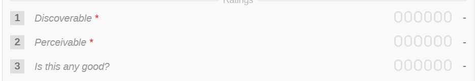
These pills suffer from several accessibility issues.
First and foremost, the purpose of the pills is not clarified via a text label. Although the text of the question is clearly displayed on the page, it is not associated with the widget (1.3.1 Info and relationships, 3.3.2 Labels or instructions).
This is fixed by wrapping the pills in a <fieldset> where the question represents the <legend> for the fieldset.
Secondly, the labels of the inputs themselves do not have text content (they are represented by a graphic), failing the 3.3.2 Labels or instructions and 1.1.1 Non-text content criteria. This can be fixed by providing a visually hidden text label or using a tooltip.
We also have a 1.4.3 Contrast (Minimum) failure due to the faint outline of the graphic used to represent the button. The button graphic outline should use at least #737373 to satisfy the guideline.
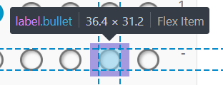
The target size of the blue pills is roughly 13 pixels on the short edge. This is about half the recommended minimum size of the target (24 pixels). The target size can be increased one of two ways. We can either physically grow the graphic itself, or provide a larger clickable are using paddings while retaining the same visual appearance of the pills.
Here is an example of using only paddings:

While using paddings technically addresses the WCAG success criteria, it still forces the user to attempt precise maneuvering because the target appears small. Therefore, increasing the target size is still desirable.
Applying fixes for several of the issued mentioned before along with some cosmetic touches to reinforce the notion that these pills behave like radio buttons we get something like this:

With these change, the target area could be at least 30px on the short edge (vertical) with the graphic itself being 20px (the actual sizes depend on the font size, or should at least). This gives sufficient surface area to allow less precise selection and reduce fat-fingering on touch devices.
The interface uses hidden radio buttons which are hidden using the display: none rule. This is not a valid way to hide form controls as it renders them inoperable to keyboard users (2.1.1 Keyboard). The styling has to be corrected to hide the input visually without making it hidden from the accessibility technology or keyboard users, and a proper focus outline must be rendered for labels that are associated with the focused radio (2.4.7 Focus visible).