URL: /event/{id}/editing/paper/list, /event/{id}/contributions/{id}/editing/paper
Criterion: 3.2.4 Consistent identification (AA)
Users at any level of ability rely on consistency of the UI elements–in appearance, labeling, and layout–to navigate efficiently around applications and reliably get things done. This is especially true for users with reduced visual ability, to whom unpredictable page structure presents a more serious obstacle.
Whenever we have page elements that repeat on multiple pages, we want them to have a consistent appearance, layout, naming, and behavior.
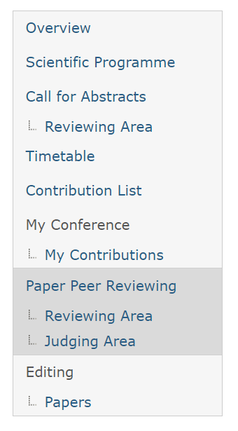
The conference pages feature a sidebar that looks like this:
The editing page, on the other hand, has a markedly different sidebar:
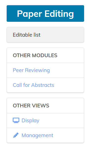
Even disregarding the inconsistency in the visual presentation, the big detour in the layout and behavior of the sidebar creates a jarring experience for most categories of users (except the developers, I suppose).
To address this issue, a radical change must be made either to the paper editing section, or all other sections of the conference, or a mix of both:
- The page layout between these pages must be the same (same page header, same location of the main heading, and same purpose of the page heading). The structure of the other conference pages generally make a little more sense from the information architecture point of view.
- The navigation sidebar should be made identical between these pages. The one used on pages other than the “paper editing” page makes more sense as it includes all sections. The functionality offered by the simplified sidebar on the paper editing page is duplicated by the usual toolbar that appears at the top on all event pages, and “Display” option does not belong on a non-management page.
- The visual appearance should be made consistent between these pages as well. For instance, the table on the “call for abstracts → reviewing area” page does not look the same as the table on the “paper editing” page. Though, this is a minor issue, and does not cause failure of the SC 3.2.4 (most users are fairly resilient to minor differences in visual appearance, and those with reduced visual ability are not concerned with it anyway).
- The behavior of the table filtering must be made consistent between the pages such as “call for abstracts → reviewing area” and “paper editing”. In the first case the filters are applied in a two step process involving a modal dialog, while in the latter case, it is a drop-down. Even though, in isolation, it may seem like a drop-down is a better choice for the “editing” page, it makes the UI workflow inconsistent and breaks the intuition about the behavior that users build in other places.
The last two items also apply to inconsistencies between the presentation in various review areas, where sometimes a table is used, while other times a list is used. Presenting all these lists consistently will provide a smoother workflow when the same people are involved at different stages, a scenario which the application appears to allow.