URL: /event/{id}/registration/{id}
Criteria: 3.2.2 Labels or Instructions (A), 1.1 Text alternatives (A)
We have received some reports of blind people being unable to complete the registration form, so we prioritized work on this part of Indico.
Several accessibility issues were identified in the form, but most critical are:
- Form controls that are not properly associated with labels (WCAG 3.2.2)
- Buttons that are treated as empty by the screen reader because they contain inaccessible visual elements with no text alternatives (WCAG 1.1)
First a few notes about how labels work in general.
When a label is not associated with the form control, a screen reader user will only hear the type of the control as well as any text in the control (for text fields) and/or its state (e.g., whether a checkbox is checked). They will receive no further information about the purpose of the control. Proximity of a label to the form control does not automatically associate the control with the label. Although a screen reader user will hear this information while the page is being read sequentially, they won’t receive instructions while tabbing through the controls.
The only valid ways to associate controls with labels is to either wrap the control in the <label> tag or point the label to a control using the for attribute.
Screen readers may give any aria-label attribute priority over the associated <label> element. It is therefore important to ensure that inputs don’t have unnecessary aria-label attributes (found in one place).
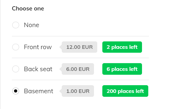
Some form controls operate as a group. These include checkboxes (under some conditions), radios, and any controls that are not standard inputs (i.e., custom controls). In such cases, we are still able to provide instruction by using the <fieldset> element with an appropriate <legend> text.
When a screenreader user focuses a control within a <fieldset>, the content of the <legend> element is typically read along with the label of the control itself. This is especially useful for controls that do not have a meaningful label. For example, a custom file upload control has “Choose from your computer”. When placed inside a fieldset whose legend is “Photo”, the button is read as “Photo group choose from your computer button”, which provides some context to the button’s function.
Note that the fieldset legend can be styled to look the same as a <label> element so there is visually no difference. UX-wise, the main difference is that the legend cannot be used to focus/operate any control, but in the context in which it is used (group multiple controls), this is expected.
To address the issues in the registration form, I’ve modified the markup so that some controls are wrapped in fieldsets, and provide necessary id and for attributes to all inputs and labels, respectively. I’ve also removed unnecessary aria-label from one of the controls (date picker).
Groups were appropriately wrapped inside fieldsets, and the individual inputs in the group were given their own id and for attributes. The <legend> was then styled to match the label appearance:
I’ve also identified a critical issue with the captcha control. It has two buttons that are effectively unlabeled (they only contain icons, with no text alternative). I will provide the text label for those buttons and that should allow the screenreader users to operate the control successfully.