Elements that are intended to be interactive should use the tags that most closely match their intended behavior. Most native form controls have various behaviors and properties that enable the users of assistive technologies to take better advantage of the UI. When we use elements that are not actual form controls, we must ensure that they enable at least the same degree of interaction as the native controls of the same role (usually this is just additional work that is entirely avoidable).
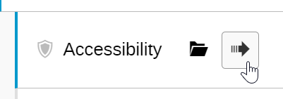
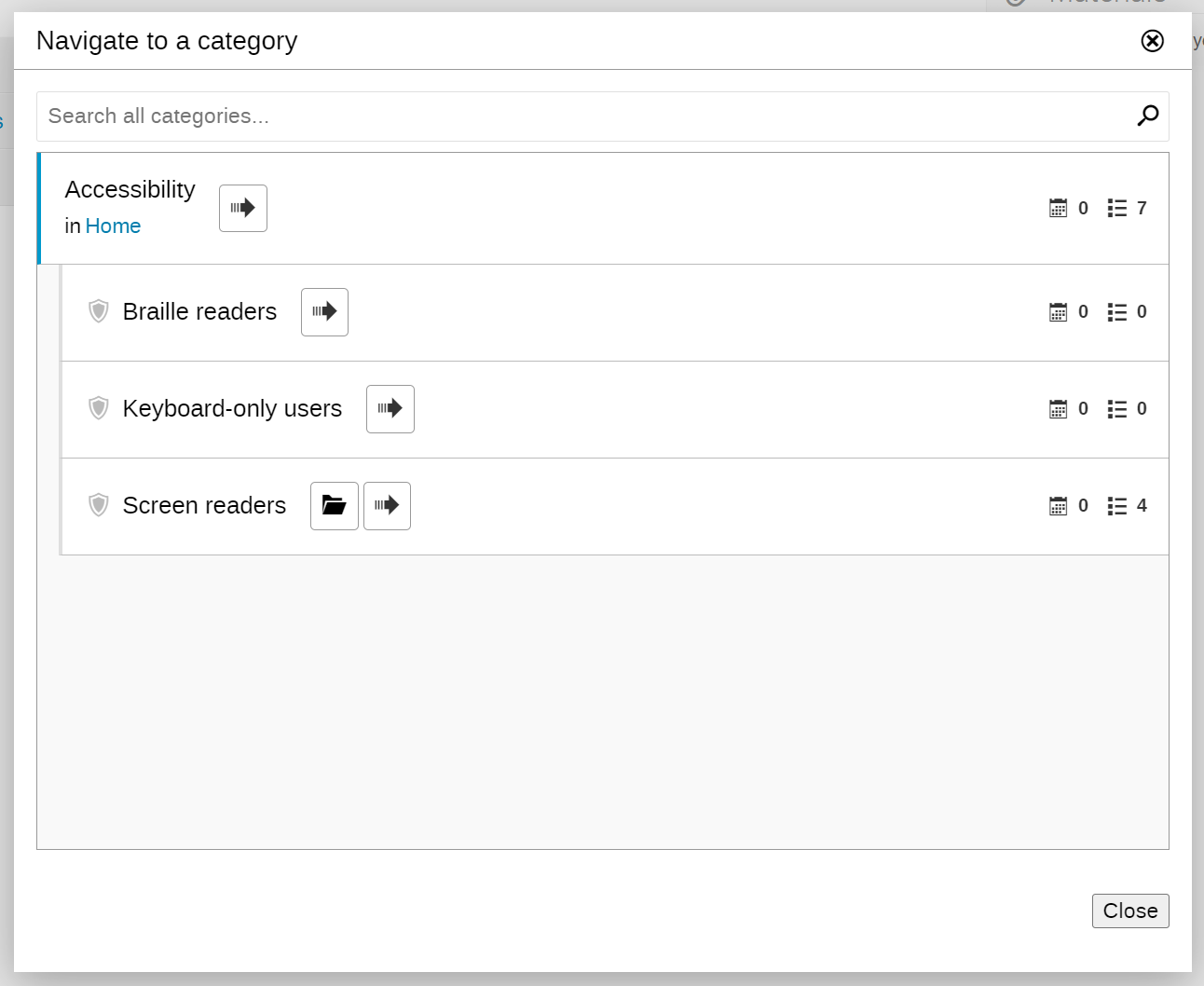
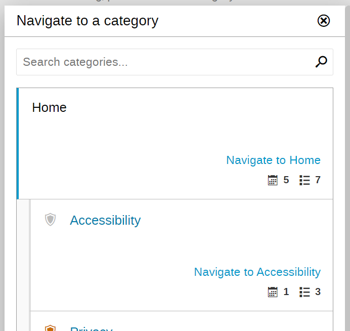
In the “Navigate to a category” modal, we have buttons that are not keyboard-accessible nor keyboard-operable because they are implemented using a SPAN tag. This prevents the user from:
Focusing the button
Activating the button using Spacebar
Activating the button using Enter/Return
Having the button announced as a button by the screen reader
And so on.
Most of the accessibility issues with this button are addressed by simply changing its markup from SPAN to BUTTON.
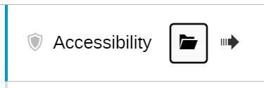
However, given the semantics of the list, I intend to wrap each item in the list with an A tag instead, and leave the button as is, as decoration. Since these links would then lead to appropriate sections of the site, we will be able to leverage the default browser behavior and avoid additional scripting. I will mark the “Navigate to” “button” using aria-hidden=true as it is non-essential information that does not contribute any additional instruction over the fact that the item is a link.
Additionally, I could also remove the “Navigate to” entirely, and style the item labels to look like proper links.
In addition to the issue described above, we have the need to announce the presence of a modal dialog. Also, the code for the category navigator uses an old jQuery-based implementation.
After some discussion, the decision was made to switch to a React-based implementation. We have two use cases for the navigator:
It is used as a stand-alone widget that triggers navigation when a category is selected
It is also used as part of the WTForm integration to augment a form field
I will proceed with implementing the base widget component first. For the first use case, I will implement a custom element that will mount the widget application within itself. For the latter case, I will do the integration the same way it is done for other such widgets, like the WTFPrincipalField.
I will be using a <dialog> element for category navigator UI. Since this is a React implementation, I’m using a portal to have the dialog rendered as the direct descendant of the <body> element. This is technically not necessary, but I find it useful to have the dialog quickly identifiable when inspecting the element tree.
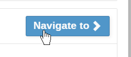
The dialog is opened through a click event on the “Navigate” button. There are two ways to open the <dialog> element. One is to simply set the open attribute on it, and another is to invoke the showModal() method. I use the latter as that also gives additional features like taking focus over from the button, presenting the interface with a backdrop, making the elements in the back inert (unresponsive to interaction), and so on. It also causes the screen reader to immediately announce the presence of the dialog.
Unless the dialog is given a label, it is announced using the first form control label inside it. We therefore use the dialog title as the label. The code for that looks like this:
Since the dialog is the direct descendant of the <body> element, it is given an <h2> heading, and the contents of the dialog are considered a subsection of the page.
Closing the dialog is done by calling the close() method on the dialog element, which is what the handleClose() does. However, the dialog will also close when the user presses the Escape key. This is a built-in feature and does not require any code. This is indicated by the aria-keyshortcut attribute on the button.
The <dialog> element also returns focus to the original button when closed. This is a desirable behavior that is built-in.
Here’s a small trick for detecting backdrop clicks with the <dialog> element.
Clicking on a backdrop technically counts as clicking on the dialog itself (event.target will be the dialog element itself) and there is no good way to differentiate between clicking on a dialog element and the backdrop.
In my implementation, I use the following trick to get around this without testing for cursor position.
First, I create an inner wrapper inside the dialog and remove any padding from the dialog element itself so that the wrapper will fill the entire surface of the dialog. (It’s important that the dialog element does not have a border as we cannot cover that).
Next, I attach a click handler to the dialog element that checks whether the event target matches the current target. This is only going to be the case when the click happened outside any of the dialog’s descendants. Since the first child element (the wrapper) covers the entire surface of the dialog, the event target will only ever match the current target (the dialog) if the click happened on the backdrop:
  function handleBannerClick(ev) {
    if (ev.target === ev.currentTarget) {
      ev.currentTarget.close();
    }
  }

  return (
    <dialog onClick={handleBannerClick}>
      <article>
      </article>
    </dialog>
  );
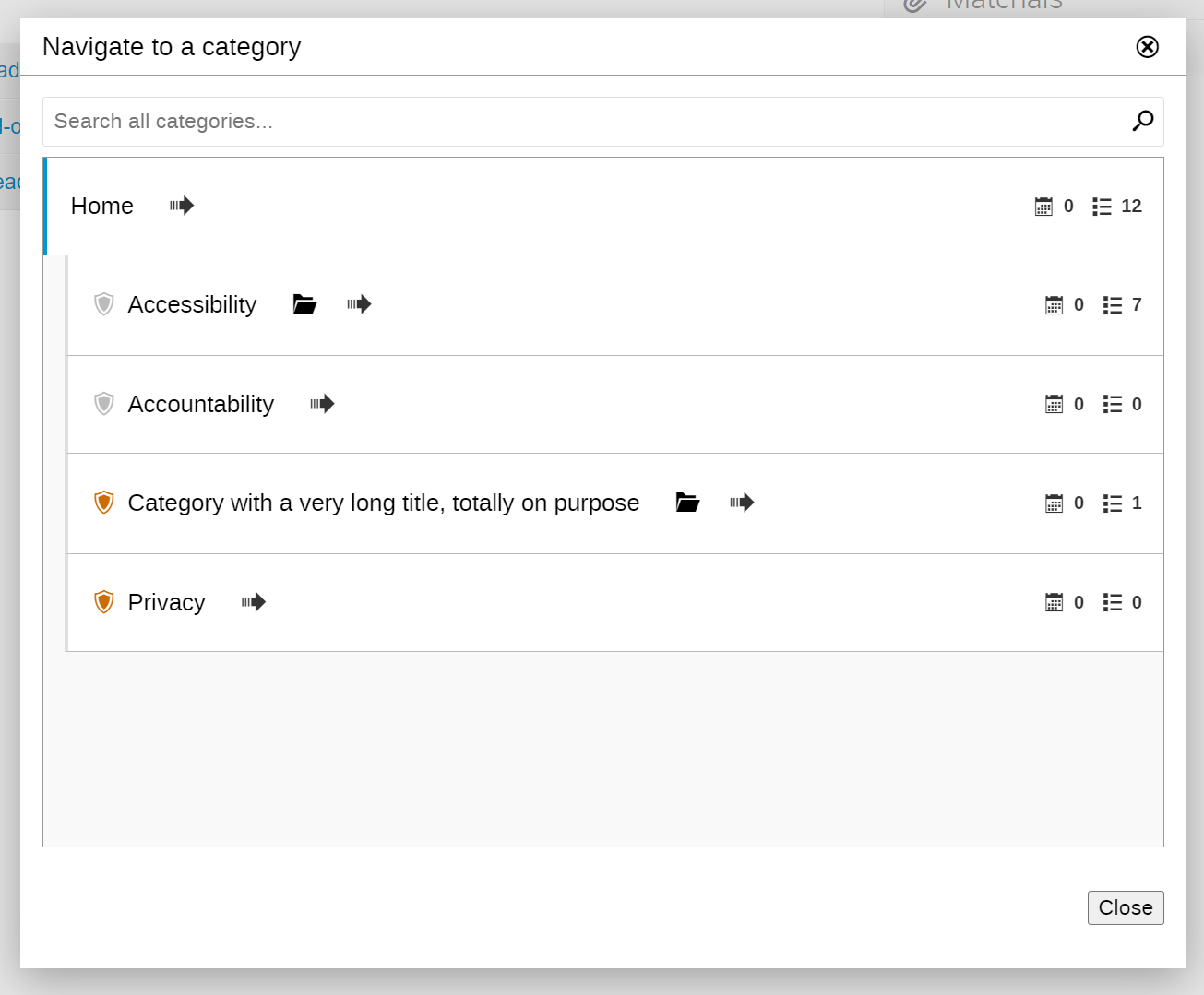
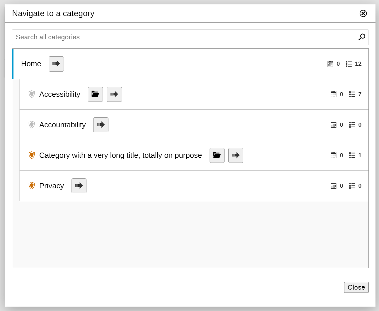
The category list now uses more obvious visual indentation to convey the relationship between the current category and its subcategories
The current category name is now an H3 heading
The category names are now proper buttons
The “Navigate to” is now always shown and includes the category name for screen magnifiers users
Ample whitespace is used between the category names on the left, and category action and stats on the right. This was done to introduce horizontal separation between different workflows (drill down the list versus navigate/move/etc.).
The greyed-out shied is used for non-protected categories to fill that space.
The numbers shown on the right now use separate icons (calendar for event count, list icon for subcategory count).
There’s still room for improvement for this layout but you get the general idea of where I’m going with it. I used the alignment and vertical spacing to keep the two workflows separate even in this layout, and the font-size difference is used to emphasize that category name and action link are different.
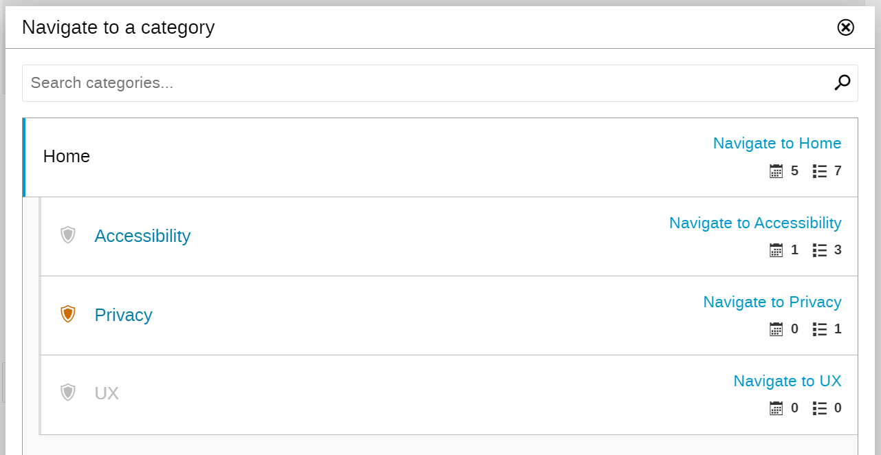
Each statistic is represented using two elements, one containing the full text and another one containing just the number. The number-only element is hidden from the screen-reader, while the full text is screen-reader only (doesn’t show up in the UI). I will also convert the full-text version into a tooltip at some point.
Better use the <PluralTranslate>component (instead of PluralTranslate.string()) which has a somewhat nicer syntax. IIRC you can also put as="span" there to render the translated string in a span w/o explicitly wrapping it in one.
Also note that “navigate to” must be dynamic. In case of event creation etc this would be something like “Choose this category” (not sure about the exact wording), or “Move here” in case of moving events/categories.
Would it make sense to make the permanent “Navigate to …” only accessible to screen readers as well? For “regular” users repeating the category name feels like it’s adding clutter.
The navigate to feature is implemented as a component that is passed to the navigator component. So the developer can use any component for this. The specified component will receive the complete category object as a prop.
If we want to get rid of the duplication, the “navigate to” button/link would need to be rendered closer to the actual title. I think that creates more clutter.
The reason link must have complete information is because screen magnifier users only see a small portion of the screen. If the separation between relevant elements is big (as in our case), it makes it difficult to use the controls.
@ThiefMaster I’ve thought a bit about what we can do about labels duplicating between the left and right side. If we abandon the idea of having a large button that takes up the full height of the area to represent the “drill-down” action, and turn it into a button that sits next to the label, then we can also do the same for the “navigate to” (or whatever developer-specified action) and then those two buttons would sit next to each other, right next to the text label. I can make those buttons either icons or an icon with a short label text like “Navigate to”.
The downside of this is that the buttons won’t vertically align, but since I don’t think we should expect people to scan the button vertically, that should be fine.
This solution would of course, necessitate the use of a tooltip at least for the first button (I don’t think we can accommodate both buttons having a visible label), so the whole project will take a bit more time.
I’ve updated the post to include an ASCII mockup, if that helps. I can do the implementation in a separate branch once I’m done with the basic functionality.
I was more thinking about a quick mockup using devtools to rearrange the action buttons or similar. Ideally on a category with a few entries, because I need to see how the real thing looks like in order to know if it’s “weird” or not
Nice mockups! I think visually I prefer the buttons w/o borders but then it’s really not clear that they actually are buttons… maybe we could also add some bg color to make them stand out more?
I’ll proceed with the version with the buttons that only have a border for now. Clean the code base a bit, and figure out the optimal way to make the button style available globally so it can be reused elsewhere. It’s not too difficult to shift stuff around later if needed.