URL: /
Criterion: 3.2.2 Labels or Insturctions (AA)
Every form control must have an associated label. Although placeholders and adjacent visible text, or even location of the control, may provide enough context to visually abled users, this is not necessarily the users of assistive technologies.
Most notably, placeholder does not serve as a label. In addition to not serving as a label, it also has UX issues such as:
- Once the form field is filled in, it is no longer possible to determine what the form field is for, especially painful when there is a field error
- The placeholder text may be mistaken for user input which causes confusion about whether the field is supposed to be filled in
- Placeholders are typically low-contrast, so they are harder to read
Placeholders can be used to provide additional non-essential information (e.g., an example of what a valid input should look like). However, my recommendation is to avoid it entirely and always use a visible text label.
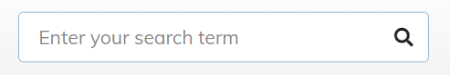
The search box in the category toolbar has no visible or invisible label. Converting the placeholder into a visible label would cause the UI to take up too much space. I therefore intend to convert the icon into a label by adding an aria-label="Enter your search term" attribute, and wrap the input + icon pair in a LABEL element so that the icon is correctly announced as a label to screen readers.
The “search” iconography is ubiquitous so I do not expect confusion about the purpose of the field. A placeholder may remain in this case as auxiliary information.