URL: /
Criterion: 1.4.1 Content on Hover or Focus (AA)
Some content is presented when an element is hovered and/or focused. With such content, we need to be careful about how it is presented to users that do not use a mouse (keyboard users, touch panel users, screen readers, eye trackers, etc.).
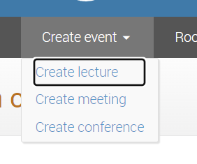
The drop-down menu on the global menu has tooltips on the items that are only usable to mouse users and touch screen users (if we count accidentally hovering by tapping as “usable”). The tooltip does not activate at all on keyboard focus.
Although I can think of several ways to improve the tooltip implementation itself, in this case I intend to insert the text of the tooltip below each item.
Generally speaking, any text that is important enough to be on the page to begin with should be provided inline where space permits.
Some general notes on tooltips.
Whenever we can, we will inline the tooltip text. However, there are probably cases where this is not possible. In such cases, we will need a viable tooltip implementation.
Since qtip2 is not maintained and not accessible, we need a replacement. After a discussion we are considering the following options:
- Find a viable alternative that is both maintained and accessible
- Write our own implementation
Requirements for the alternative:
- It needs to support both vanilla JavaScript and React integration
- Any complex positioning logic should be delegated to a 3rd party library (iow, we don’t want to end up having to maintain such code)
Another note:
Tooltips are generally intended for interactive elements. Adding tooltips to non-interactive elements is considered not accessible. This is because such elements cannot be focused or otherwise interacted in a way that would allow the user to trigger the tooltip.
A common way to add more information to elements that are not interactive is to use a toggle tip instead. It’s usually represented by a info icon (circle with lower-case letter i) or a help icon (circle with question mark). This icon is normally implemented as a button or a link (that points to the text) and the information popup is activated not by hover or focus but by activating the icon.
Alternatively, the additional information can be placed in expandable boxes such as the DETAILS tag.
I will select an appropriate solution on case-by-case basis.