URL: /
Criterion: 1.4.3 Contrast (Minimum) (AA)
Color contrast is an important aspect for the perceivability of the page content, and is also one of the most frequent accessibility failures. Different color contrast requirements exist for different text sizes, where a higher contrast requirement is used for smaller text. There are also two levels of success criteria for color contrast, where a lower 4.5:1 contrast level is considered an AA level SC, and a higher 7:1 contrast is considered to pass AAA SC for small text.
In the Indico UI there are multiple elements that have insufficient color contrast. I will highlight one example here, and will not show other examples unless they employ a different fix.

When adjusting color contrast, I use the WCAG Color contrast checker Chrome extension which provides a list of elements with color contrast issues, and includes a color contrast calculator. WEB AIM also provides an online color contrast calculator. The WAVE tool also includes a contrast calculator with live preview.
In the protection details link button, the contrast is currently 2.3:1 and does not meet the AA requirement even for large text. Here I need to consider the background as well. Although I can make the background of the button itself darker, I would lower the contrast of the button background to the header background at the same time. Therefore, I intend to make the button slightly lighter instead, and make the label text darker.
The values I intend to use for this control are:
- background: #00e417
- color: #454545
- border color: intact
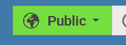
The resulting appearance should provide sufficient text-to-background contrast as well as the background-to-header contrast.
The hover state will be adjusted accordingly.
Other buttons in the session bar also have low contrast. Changing the foreground to the same value (#454545) provides excellent contrast, and has the additional benefit of unifying the label color across different button types.