URL: /
Criterion: 1.4.3 Contrast (Minimum) (AA)
Color contrast is important for perceivability of the page elements, but it is also important for distinguishing different types of information.
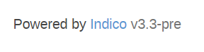
In Indico’s footer, we have the following situation:
![]()
In this case, both the “Powered by” text, and the “v3.3-pre” fail the minimum contrast success criterion. Changing the color to the minimum value that satisfies the SC, however, results in both pieces of text having the exact same color. This satisfies the SC, but we lose some information in the process.
Achieving the kind of contrast between the “Powered by” and the version number, however, is quite challenging. Firstly, the minimum color value to achieve satisfactory contrast is #757575, which is already quite dark. This value must map to the lightest part of the text, the version number. The rest of the text then needs to be a lot darker to support the idea of having two shades. The darkest color I’ve been planning to use thus far is #454545, but this doesn’t quite work in this case:
This is partly due to the text size as well (the smaller the text size, the less we can see these differences). Now this particular text is already below the minimum recommended text size, but not by much.
What we can do here, though, is to also make the text bold. Provided that the text adheres to the minimum text size recommendation (it doesn’t now, but it will), then making it bold reduces the contrast requirement as well, and we can therefore use a lighter shade and a contrast ratio of only 3:1.
![]()
For this particular case, I intend to use the general text color #646464 in the footer, and #919191 for the version number with a bold typeface.