Contrast / category listings

URL: /
Criterion: 1.4.3 Contrast (Minimum) (AA)

With the category list UI, we are again dealing with insufficient color contrast. In this case we have several elements:

  • The links (blue)
  • The “empty” indicator (grey)
  • The decorative arrow icon
  • Category link background (light grey)
  • Page background (white)

In this case, we have to improve contrast in the following areas:

  • Link to link background
  • The “empty” indicator to background
  • Link background to page background

The purpose of the link background so to separate the list from the page itself, and also separate links between themselves. I technically do not need to change the background color of the link in order to achieve these separations. Instead, I can manipulate the border color.

The icon is purely decorative, so it is not necessary to do anything about its contrast.

I intend to introduce the following changes:

  • Link color: #0075a3
  • Link background: as is
  • The “empty” indicator color: #454545 (same as button labels)
  • Link background bottom border color: #6e6e6e

The result should look like this:

The “empty” (or event count) text there is low-contrast on purpose because it is generally pretty irrelevant for most users… so I’m not sure what’s the best solution there, considering that the whole point there is to make this information appear in a very subtle way…

What do you do when the person to whom this information is relevant cannot perceive it because it’s subtle?

My guess here is that the intention is to keep the empty information a little bit more low-key so it does not steal the focus from the (more important) category names.

In general, I would think that the amount of events in a category is very secondary and rarely required. While completely removing it altogether might not be an improvement, it should not distract from the more relevant information.

Maybe it could only be displayed on hover / selection of the category?

Also many kudos to @hayavuk for being so up-front with your intentions and spelling the reasoning out for us in such detail. :100:

2 Likes

Sadly, displaying things on hover introduces more accessibility issues rather than solve them. Tooltips, for example, are the main source of accessibility woes.

What’s really the use case with these numbers? How do people use them?

I have no idea. As an administrator I have used them once in a year during our routine-cleanup to determine whether I can safely delete a category, but that is all.

To me that sounds like quite an important use case, especially if it’s only once in a while.

I am not sure if that would require the word empty or the event count to be displayed as prominently as the category name. Maybe one could convey this distinction in the presentation of the name itself? On the other hand, all the housekeeping tasks themselves could be a separate menu for the admins, since there are quite a few tedious ones… but that is out of scope here.

TLDR: If the information on events in a category was not there at all, I would have to do a handful of clicks extra in a year. I would not consider this a major issue and would even lean to not having the information displayed at all instead of having it displayed in a prominent way. This is of course a purely personal preference.

I think that would be a great idea. In that case, you could have more specialized UI that’s purpose built for that (e.g., “Remove empty categories”).

Would making the contrast stronger on hover be an option?

I asked this question, and no, that would not be acceptable. The problem with hover is it’s not something everyone can activate. The default state must satisfy the minimum accessibility requirements.

A few options we have are making the category title larger, making it bold, ensure enough separation between the title and the number of items in the category (provide a larger gap between them, for instance), indenting the count when the layout switches to a vertical one where the title is rendered above the count, and so on.

Rather than just adjusting the contrast, why not using a label component instead and always displaying the number of events, even if it’s zero? Quick example using ui blue label classes.

It doesn’t look bad, but IMHO it puts way more emphasis on this thing than most people need…

“x events” and “empty” is much faster to distinguish than “x events” and “0 events”…

I’ve already noted somewhere (I hope) that “empty” by itself is also a minor accessibility issue. It is not clear what “empty” refers to. I second the suggestion to use “0 events” or “no events”. Although to us it is clear what “empty” means from the context, not everyone actually has the same context. For instance, if you’re using a screen magnifier you’re only seeing small portions of the page at a time. Due to the distance between the category title and the event count, we’re almost guaranteed that “empty” will be out of context.

I know, I know. Accessibility is tricky. :slight_smile:

2 Likes

I still think that removing the information altogether is a viable option. Naturally, it always feels counterintuitive to remove information that is already there, but I still am at a loss why the information is needed in such a prominent place to begin with.

How about a little test? Let’s say this is removed in an upcoming minor update, coupled with a short feedback survey on the changes. If the users do not like it, the removal will get rolled back and the discussion can continue…

At least on our big CERN instance it’s a nice indicator of how active a category is (even without the numbers containing any time component)…

And sorry, I don’t see how removing it is better than leaving it in a poorly-accessible way. This feels like a case of “if some cannot have(/access) it, nobody should”… ;x

Sorry, it was certainly not meant this way. Especially in the context of activity, one could maybe also consider a different kind of visualization (given that activity usually is measured over a certain amount of time in the past). Maybe a wording like

  • “very active” (100+ events last period)
  • “active”, ( < 100 events last period)
  • “barely active”, (< 10 events last period)
  • “inactive” (0 events last period)

could be sufficient. The definition of last period could be configurable (week/month/year?)

Edit: And just as I write this, I realize that this does not change the original problem of visualization, so discussing this posts’ content further probably is a moot point in this context. I’ll let it stick around, maybe something can come from the idea still…

So we’re basically discussing two separate concerns that are kinda conflated into the same thread:

  • We’re talking about the usability of the event count, its different use cases and whether the current implementation is optimal
  • The accessibility of this and any other competing implementation from the standpoint of accessibility

Usability

The usability is a range from unusable, to hard to use, to easy to use.

For information display, here’s a few ways in which we can use the data (current solution highlighted):

  1. We cannot get the information at all: unusable
  2. We could directly connect to the database and query it: hard
  3. We could dump the database as a HTML table: still hard
  4. [Current] We could format the data but still show it verbatim: easier, but still not quite easy because it’s up to the user to interpret this information based on the use case
  5. We could provide use-case-specific interpretation for the information: easier, but again, still depends on the use case, and now we also need some BA to do this
  6. We could provide actionable interfaces based on the information: this is the actual easy solution from the standpoint of, but requires more development time and also a BA project pretty much

The current implementation is mostly 3, but the part where we say “empty” is actually 4. It’s giving us a very specific interpretation of the raw data, and also differentiates empty from non-empty. On the other hand, it still leaves it up to the user to go through the decision-making regarding what to do with the information.

The examples of the point 5 would be things like:

  • filtering the list based on activity
  • sorting based on event count
  • showing only empty/non-empty categories
  • providing the ability to delete only the empty categories (perhaps those that were empty for at least X amount of time)

Clearly, these are all off-topic in this section of the forum, but valid concerns. Developers want to improve things when they see an opportunity, and that’s pretty normal. On the other hand, doing the changes that are most effective is better than randomly doing changes.

Accessibility

Accessibility looks at things a bit differently. I assume that, if it’s on the screen, it is probably important, and therefore must be perceivable to as many people as possible. Having poor contrast and showing only on hover are basically bugs from this standpoint.

To me this is a point that must be balanced with “If some can have access to it, they should.”

Anyway, I’m currently working on the category navigator, and I see no reason why we couldn’t reuse that interface here, too. The navigator offers additional tools for drilling down the entire tree, but the list itself is serving the identical purpose.

I’ve been working on the tooltips since mid-last-week, so let me report on that.

The original request for the tooltip was to reuse a known existing positioning library. I’ve looked at what’s out there, and the situation is basically that there’s just one library, Floating UI. Popper is abandoned in favor of FUI, and there aren’t any other libraries (they all use Popper or FUI under the hood).

I’ve looked at the FUI library source code, and it’s essentially an entire framework for positioning. The code is quite complex and there’s a lot of it. Given that our use case (tooltips) is fairly simple, I concluded that using FUI would be a big waste of bandwidth. We wouldn’t be utilizing more than a fraction of what it does. Extracting the relevant positioning code was another thing I’ve considered, but given that it’s a framework, it has lots of internal dependencies that make this not worthwhile. (Tree-shaking would be faced with the same issue.)

After a bit of experimentation, I’ve come up with positioning logic that comprises of about 31 lines of JS augmented by a couple of lines of CSS, which takes care what we need for the tooltip. You can see the PoC for this on Codepen.io.

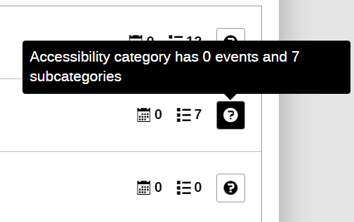
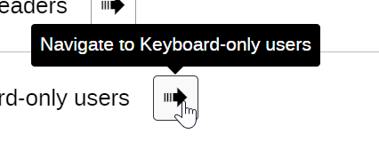
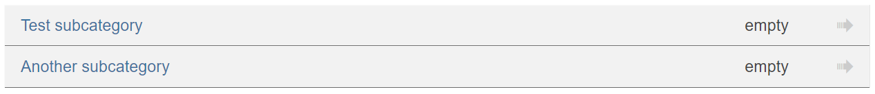
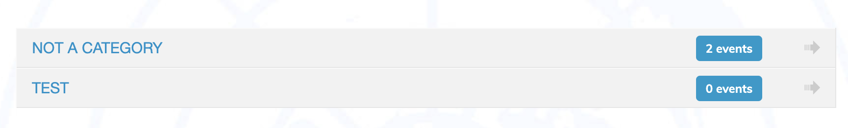
Here’s a screenshot of it in the actual Indico app.

image

There’s one thing I still haven’t finished with this solution, which is to track the reference element when the container is scrolled. Since scrollable containers’ scroll event does not bubble, I need to locate the scrollable element and makes sure the scroll event is relayed to the tooltip. This is not a big issue, though.

While solving the tooltip, I’ve also managed to get it showing outside the bounds of a container that has a scrollbar, which Popper/FUI don’t do (as far as I know), so we actually did one better in that regard.

image

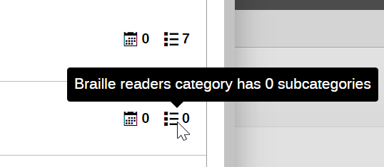
Now, when it comes to the tooltips shown in the category/event count icons, these cannot actually be implemented as tooltips (the screenshot was just a test I was doing). Tooltips can only be added to elements that are interactive and focusable, which these two icons are not. In the actual implementation, I’ll need to add a toggletip (usually represented as an info button–circle with lower-case i or question mark). I should be able to reuse the tooltip code just fine.

Finished the toggletip implementation:

image

Will fix the small cosmetic issues tomorrow, refactor the code and create a draft PR for review.